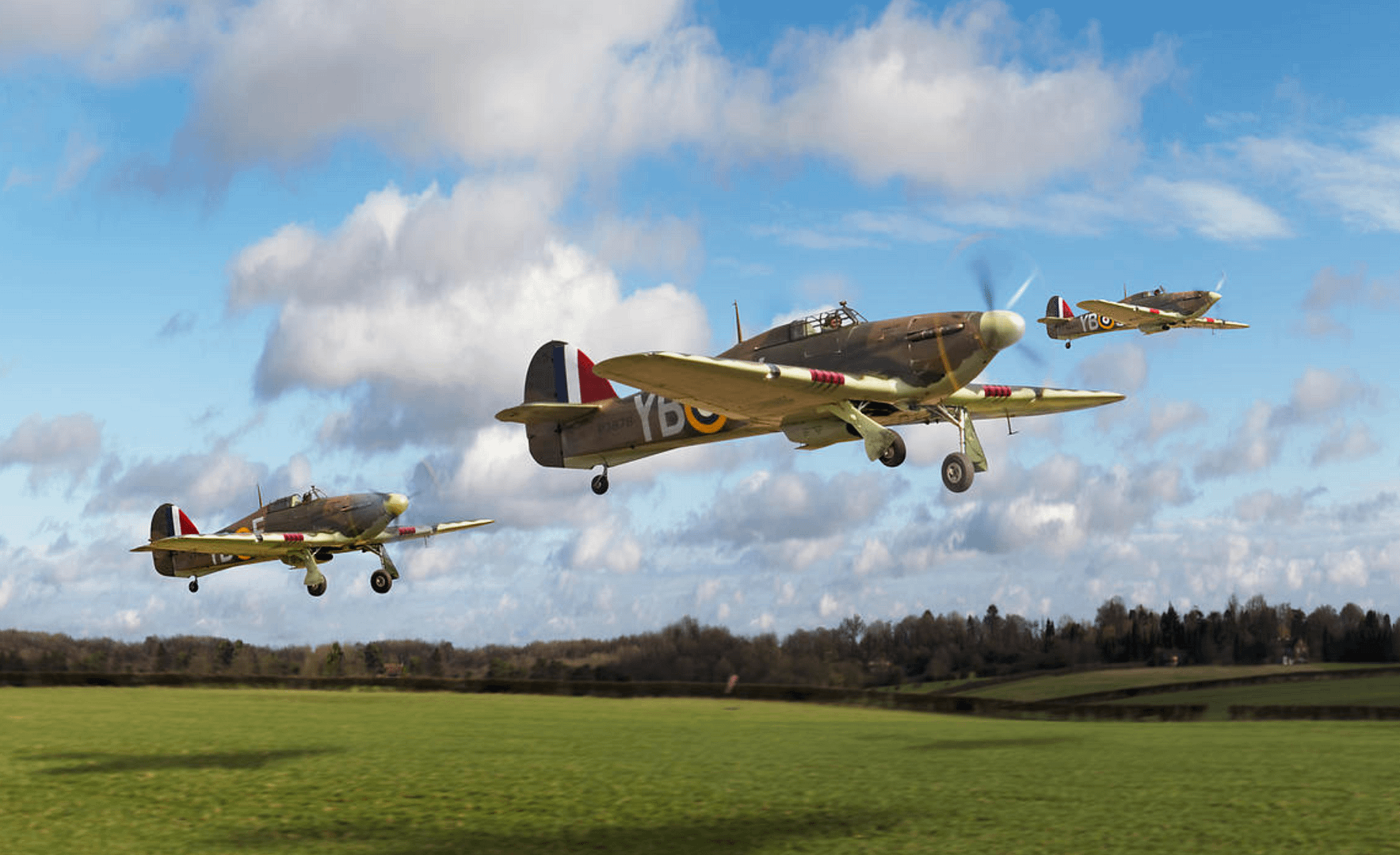
High Wycombe, 18 February 2012
What does a spinning aircraft propeller look like?
You’re thinking I’m daft. Anyone who’s ever seen even an office fan knows what a spinning prop looks like.
Right. It’s just a blurred disk.
So why is it that in almost every photograph you’ve ever seen of a prop aircraft you can not only see but in effect count the propeller blades?
The answer is obvious of course: photographs are a sliver in time and if you are going to catch a moving aircraft without showing it as a blur, you need to have a fast enough shutter speed that it will also ‘stop’ the propeller.
The effect of this will vary with the speed of the prop’s rotation – which in part depends on the different phases of flight – and of course the shutter speed.
So the question that I have been grappling with is: what looks ‘right’?
Dead engine
I want to know because, in a new departure, I am developing a range of aviation-related digital pictures under the Flight Artworks brand.
These are photographically based, but the source material features a motley variety of prop rotations – from the total blur (rare) to the stationary (which looks just silly in my opinion – as if the engine has seized in flight).
I found that, to render them into photographic (or photorealistic) backgrounds it was easier, usually, to recreate the spinning prop from scratch. So I could make it look like almost anything I wanted.
I debated with myself whether to mimic the effect of an artfully chosen shutter speed – good blur but with discrete blades visible – which a crack aviation photographer will usually strive for. Think Paul Bowen, for example: http://www.airtoair.net/gallery/gallery-bombers.htm.
Or whether to recreate what you actually would see if you were right there. After all, in a typical air-to-air scenario, where is the viewer? Hanging somehow in space?
After a faltering start I’ve plumped for the latter. In the Hurricanes image above – with the viewer standing on the ground, I suppose – I started with a single prop blade, painted the tip yellow, and spun it into a circle (this worked better than spinning three blades). Then once it was pasted onto an aircraft I resized it and altered the perspective to fit – and adjusted opacity right down.
[UPDATE: 19 Feb 12] In response to online discussion of this approach and a review of more photos, I then also added some reflected sunlight ‘shimmer’. This needs to be related to the surrounding light but I think it adds a good sense of depth and movement to the props.
But I’m far from being sure about all this. So comments welcome please.
[Sent before my update] I was very pleased that at the last two airshows I attended this past summer I managed to get the perfect all blades showing but with blur images that you describe but previously I have a lot of images with the frozen engine look which I hate. I have published them that way because most of my attempts to blur them correctly in Photoshop did not work well although I have managed it on occasion. I think what you have done is preferable to the frozen look at least. Good job. Cheers.
Simple: propellers should be presented as discs. That is how they are seen by the human eye. That aside, a full disc also makes a painting far more dramatic – it relates movement and speed. Trouble is that, quaintly, almost all Brit aviation pro-photographers dare not shoot at under 250th second. The late Steve Fletcher was an exception.
Full circle props. You will never see them when you see the aircraft from behind. (Push props excluded.) The simple reason is the props are black facing the cockpit to make them invissible to the pilot. From the back you will only see props when they are somehow frozen in time. Also you will only see full props when the aircraft is flying toward the sun. When full props? Looking to the front of an aircraft flying toward the sun.